
Advanced CSS Layouts: Introduction
I am studying advanced CSS layouts with @skillcrush, in this module we will cover two popular CSS layout systems: Flexbox and CSS Grid

I am learning with Skillcrush. Please check them out and sign up if you're looking to break into tech!
Receive $250 off your course by using the link above. Use the coupon code: TWIXMIXY
NOTE: this discount is for Break Into Tech + Get Hired package exclusively.
It's the same program I am participating in!
𓊁 Greetings travelers! We are studying advanced CSS layouts with Skillcrush. In this module we will cover two popular CSS layout systems: Flexbox and CSS Grid.
The way Skillcrush breaks down each module is by starting with a video covering the content for the module, then they will have a written lesson on the same content so you can learn via multiple methods of teaching. Then you will have anywhere between 2-6 challenges per module and wrap it up with a quiz. I’ll be breaking down what I am learning in each section and explain my thought process as I am going.
If anywhere along the way you see where I may not be understanding something in the way you have previously come to know it, I’d love to hear from you in the comments! You do have to be a Substack member to comment, but don’t worry you do not have to pay a subscription fee. I will always have my learning content available for free, just look for the option if you are prompted to become a paying member.
Responsive CSS Layouts
→LAYOUT SYSTEM
A collection of CSS properties that work together to tell the browser where to render HTML elements on the page.
CSS Layout Basics:
Responsive layout
Mobile-first development
Media queries
→ RESPONSIVE LAYOUT
A method of arranging website content so that it adapts to a user’s current screen size.
→ MOBILE-FIRST DEVELOPMENT
The process of designing a website for smaller screens first, and then using code to adapt the site to larger screens.
→ MEDIA QUERY
A CSS rule that can change the style of an HTML element depending on the size of the screen.
(min-width) property - assign a specific style when a browser window exceeds a minimum width
CSS Layouts & Your Class Project
Layout Systems
Both Flexbox and CSS Grid allow application of one or more properties. These are called CSS rules. They control the position and size of the HTML elements. Additionally they have properties that can adjust to fit different screen sizes.
Responsive Layouts
A true responsive layout will look good and be interactive on any device. This can be tested by viewing a website on devices of different sizes or by shrinking the screen size on a larger device like a desktop/laptop.
Mobile-First Development
Starting with mobile-first will enforce establishing the most important details display well. Then you can use the media queries to adapt to the larger sizes and include less important content.
Media Queries
@media {} property allows us to make website breaks so that when a certain thing is happening on the page, we can write different CSS rules for it.
The most comment adaptation of this is screen sizes.
@media (min-width: 640px) {} will apply to tablet size an up. You can set another query for desktop screen size by seeing the minimum width to 1024px.
Your Class Project
Now to receive our assignment for this module. Or it may even be for the entire duration of the Advanced CSS Layout class. Depends how the teachers want to break it down.
This assignment will be a news website from Hometown USA. We’ll want sections like articles, weather, events, etc. We will use both Flexbox and CSS Grid to accomplish this and adapt it to multiple screen sizes.
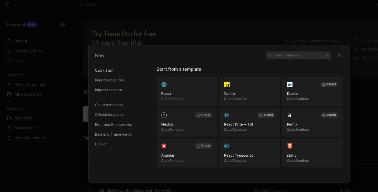
We will use CodeSandbox for this project. SC also provides us with some resources to check our responsive code.
Say Hello to CodeSandbox
Previously in my Javascript and JS React courses I was already introduced to CodeSandbox. So I’m going to skip over the intro aspects and go straight to the project creation.
We’re creating a static environment.
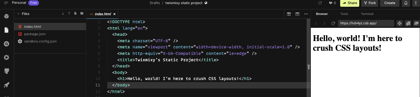
Updated the title and header.
Then updated the project name as well.
Forked the project and renamed it accordingly.
And that’s it for this challenge! If you’ve never used CodeSandbox before I definitely recommend creating an account and playing around.
What I like most about it is that I can host projects there that need a server to run the javascript.
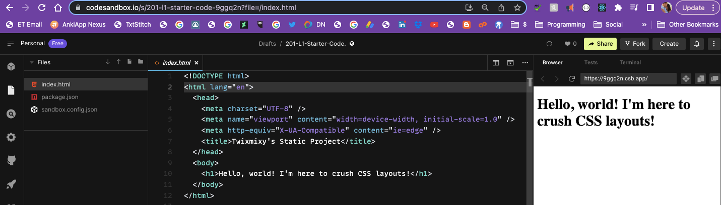
Writing Your First Media Query
For this challenge, we set the width for all the browser sizes using media queries.
html,
body {
  margin: 0;
  padding: 0;
}

p {
  font-family: sans-serif;
  font-weight: bold;
  color: #3b3b3b;
  font-size: 18px;
}

.resize-me {
  text-align: center;
  margin: 0 auto;
  padding: 16px;
  background-color: LightPink;
  box-sizing: border-box;
  /* Add default width here */
  width: 90%;
}

/* Add first media query here */
@media (min-width: 640px) {
  .resize-me {
    width: 50%;
  }
}

/* Add second media query here */
@media (min-width: 1024px) {
  .resize-me {
    width: 30%;
  }
}
See it in action on my CodeSandbox.
Quiz: Introducing CSS Layout Systems
Time to put my knowledge to the test!
100% So that means on to the next module!
What did you think? Leave me a comment and share!