My Front End Developer Portfolio & all the struggles on the way!
This week I built my front end developer portfolio with @skillcrush!
I am learning with Skillcrush. Please check them out and sign up if you're looking to break into tech!
Receive $250 off your course by using the link above. Use the coupon code: TWIXMIXY
NOTE: this discount is for Break Into Tech + Get Hired package exclusively.
It's the same program I am participating in!
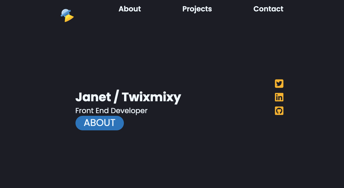
🏆 Greetings travelers! This week I built my front end developer portfolio with Skillcrush. In this article I just want to cover a few things I learned during this time and point out some interesting aspects to my website.
This week I also was accepted into UC Berkeley! I will be taking their Full Stack MERN Coding Bootcamp and I’m really excited for everything I’m going to learn.
You can subscribe without signing up for a substack account! Also just select “None” when subscribing. All the content from my learning journey is free.
Code by hand or Boilerplate?
Well… I ended up doing both. Actually since beginning this Skillcrush course I have built my portfolio probably 6-7 times now.
For real though…
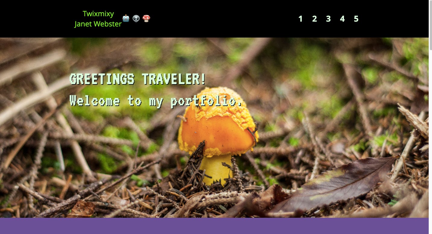
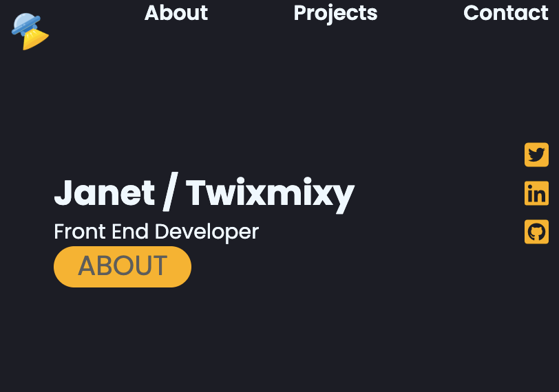
And this one I’ve rewritten at least 3 times now…
🤔 still not sure if I like the color scheme, but sometimes you just have to keep moving!
Code by hand
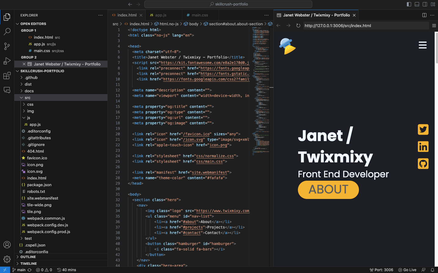
So yesterday I coded up a website with HTML, CSS, and a tiny bit of JS.
Very simple. Only having the index.html, style.css, and app.js along with any pictures needed. All of my icons are sourced through fontawesome and do not need to be stored on my server.
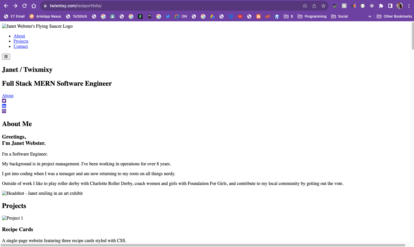
However… when I uploaded it to my test portfolio site… it showed up like this…
I still don’t know why. I’m waiting to hear back from my TAs to see if they can help.
HTML5 Boilerplate
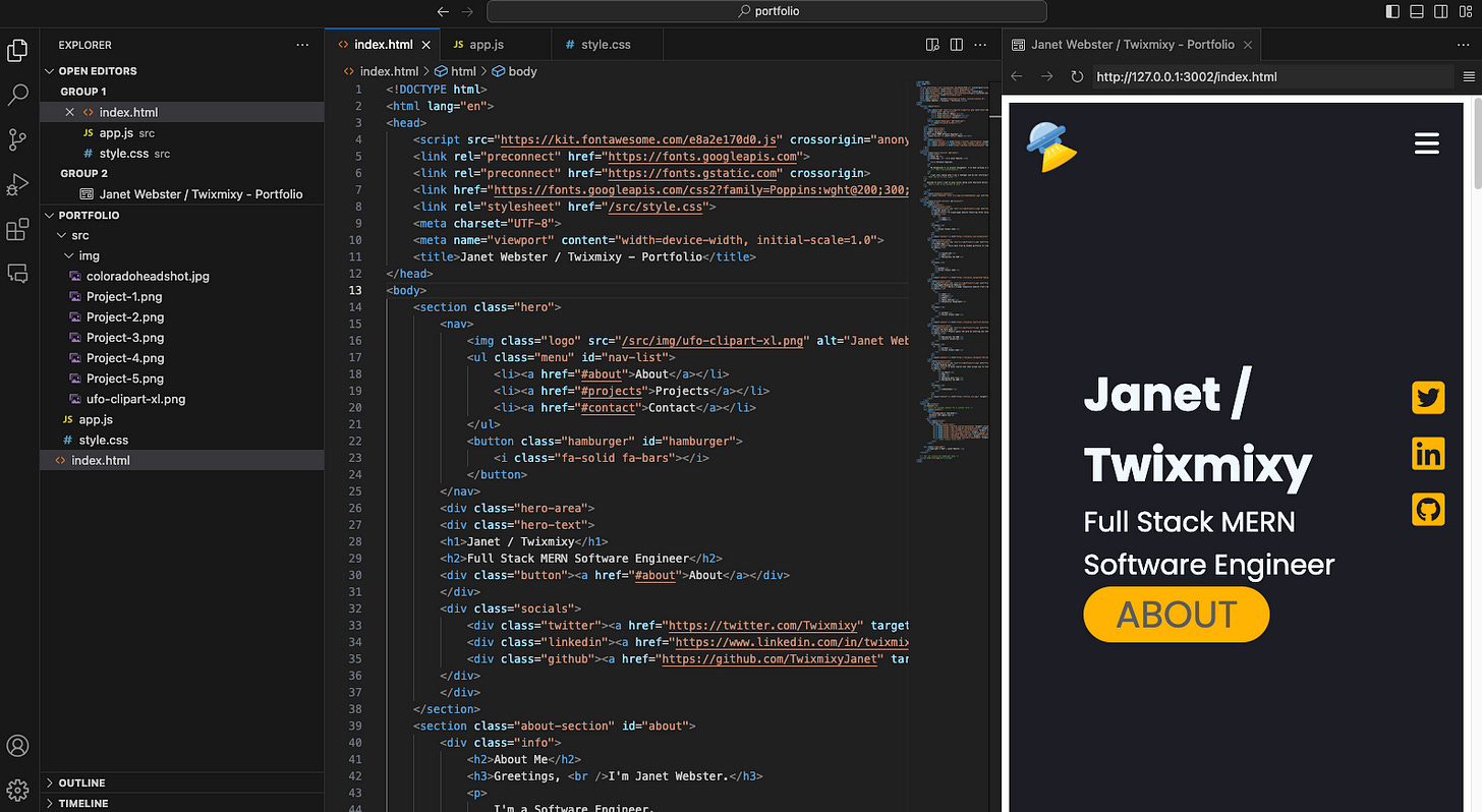
So this morning I decided to completely recreate what I made yesterday in a boilerplate. Which is a bit more complicated…
To start off… LOTS of documents that I don’t know what purpose they serve. Now I’m sure I could figure out some of them by going back through my lessons to determine their use.
Additionally… why is my index.html file in the /src/ folder?? that doesn’t make sense to me, but then I had issues when I tried to extract it and reroute everything. I may try again if I get impatient enough, but I’m trying to wait to see if my TAs will help me out.
However, if I go to the /src/ folder on my server, it works!
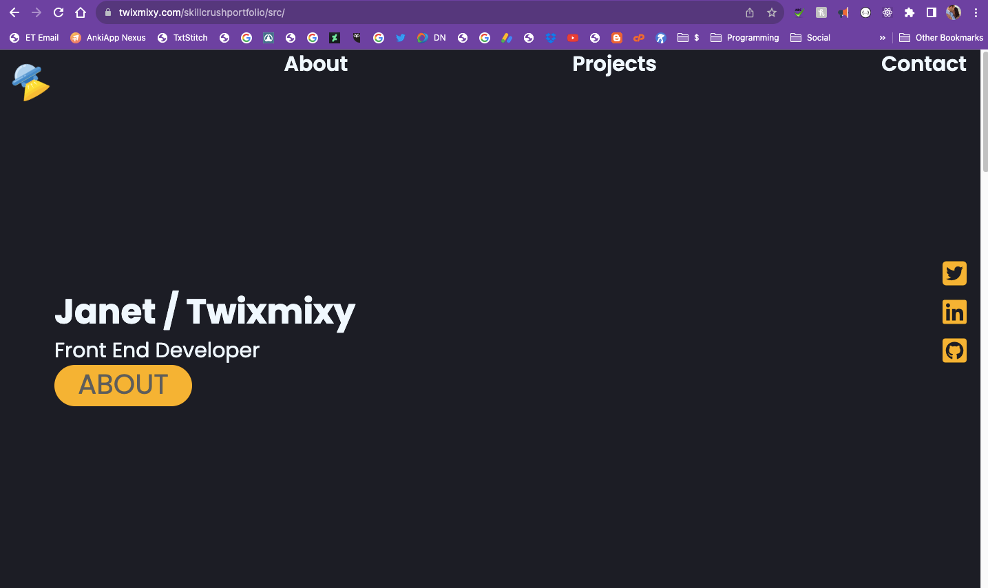
So I don’t feel comfortable updating my main portfolio website until I figure this out.
What else did I learn?
@media breaks
I better familiarized myself with screen breaks so that I can have my website display one way on phones and another on larger screens. I only did one break for this website since there isn’t too much content.
I found that I needed to rewrite a lot of my css to be focused on mobile first, then when I expand the screen see what I needed to copy over to the media breakdown and update the properties accordingly.
Here is my larger screen media breakdown:
@media (min-width: 640px) {
.hamburger {
  display: none;

}

.menu {
  display: contents;
}

ul {
  display: flex;
  list-style-type: none;
  width: 500px;
  justify-content: space-around;
  font-size: 30px;
}

ul a {
  color: rgb(240, 248, 255);
}

.about-section {
  display: flex;
  flex-wrap: nowrap;
  justify-content: space-around;
  padding: 80px;
  background-color: #ffebbb;
}

  .projects {
  display: flex;
  flex-wrap: wrap;
  justify-content: space-around;
  align-items: flex-start;
}

}
Flex/Wrap
I REALLY struggled trying to get my information to wrap when the screen was smaller.
I didn’t fully go into it with the mindset of coding from the mobile version first. Mostly due to the menu (which needed to disappear all together on mobile)
I’m still trying to wrap (har-har) my head around flex/grid/wrap and all that stuff, so I wasn’t sure which properties would accomplish what I wanted.
You can see the entire code here…
No promises it’s the same code base as when I’m writing about it now!
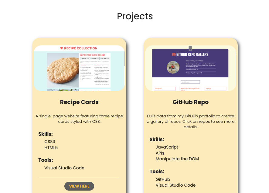
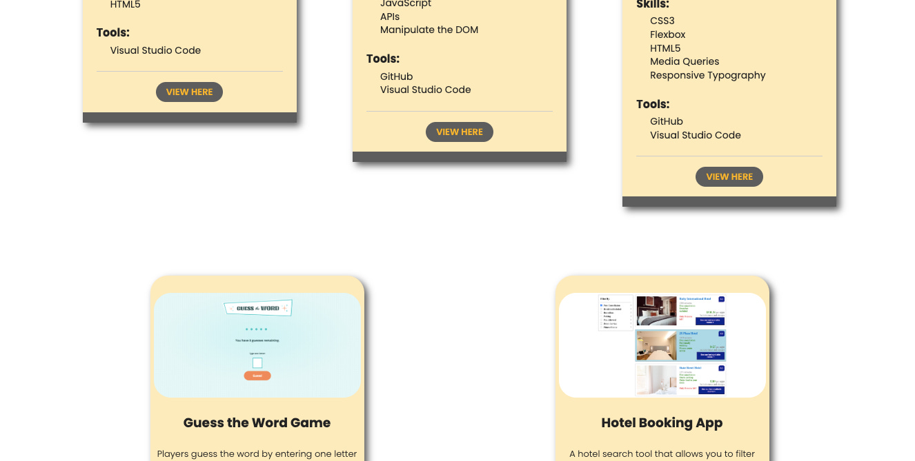
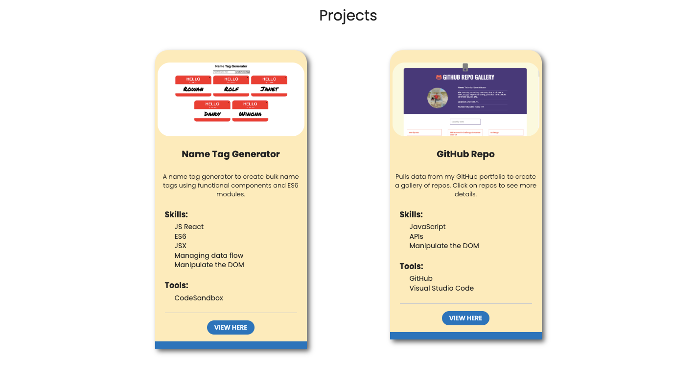
The projects section is where I struggled the most. Trying to get each project card to wrap as the screen got smaller. Each card is a different height as well, so making sure they are flush at the top was also a struggle.
Mobile version of project code:
.project-card {
  min-width: none;
  max-width: 310px;
  height: fit-content;
  box-shadow: 5px 5px 10px #5d5d5d;
  margin: 50px 15px;
  padding-bottom: 19px;
  border-radius: 25px 25px 0 0;
  border-bottom: #5d5d5d 15px solid;
  background-color: #ffebbb;
}

.project-card ol {
  list-style-type: none;
  text-align: left;
  font-size: 14px;
}

.projects {
  align-items: center;
  justify-content: center;

}

.project-section {
  display: flex;
  justify-content: center;
  flex-flow: row wrap;
  text-align: center;
  padding: 80px;
}

.project-img {
  margin: 25px 0 0 0;
  width: 300px;
  border-radius: 25px;
}
.project-section having the display: flex; and flex-flow: row wrap; were final to get it to cascade how I wanted it to.
Larger screen mobile code:
  .projects {
  display: flex;
  flex-wrap: wrap;
  justify-content: space-around;
  align-items: flex-start;
}
Mobile I found I needed to apply it to the .projects and the vital points were to apply the display: flex;, flex-wrap: wrap;, and justify-content: space-around; (so that it even spaced each project from each other). I’ll be curious to hear what the TAs feedback is on how it’s setup!
Most vitally we needed the align-items: flex-start; to get each project flush at the top with each other.
Now it does mean when the screen is at it’s largest it looks a little weird here:
Not sure if that matters much?? or if I should care?
Boilerplate/GitHub Issues
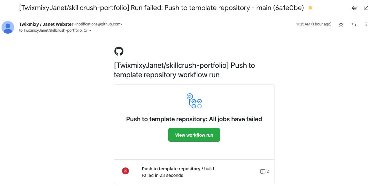
Every time I commit the boilerplate code to github it throws errors at me. I’m SURE it’s because of some files I didn’t do cleanup on, but I’m not sure which ones I should clean up.
I keep getting emails like this.
What else do I want to do?
I’d like to add more javascript! - like a contact form that would utilize JS
I want to add a “More Projects” button that will go to another page will ALL of the projects I’ve done so far that I’m proud of
My Errors Fix w/ Skillcrush
I had issues with my Boilerplate as listed above. The files weren’t where I expected them to be. So ends up I replicated the wrong repo. I replicated the HTML5 Boilerplate generator and not the actual boilerplate. I fixed that issue and copied over my code. Reviewed quickly for errors.
The other issue I ran into was the relative URLs and the absolute URLs for my images. If I use absolute (the entire URL) they images display fine, but if they are relative to the location of the index.html file then they won’t dispay.
…and wouldn’t you know it?! It’s because of a stupid little / before my file path.
Not working:
<img class="project-img" src="/img/Project-5.png" alt="Project 5">Working:
<img class="project-img" src="img/Project-5.png" alt="Project 5">Why does VSCode allow for that to work in the preview if it isn’t going to work live?? Or I guess the better question is why doesn’t the browser recognize it when it’s a legit file path?
Anyways… time to launch my portfolio!
Skillcrush Portfolio Review
I turned in my portfolio and the team reviewed it.
///// ROUND 1
I received feedback on my portfolio! So time to accomplish some of these recommendations. Here is the feedback I received:
1) Your projects
- The Recipe Cards is a fun project and was a great exercise when you were first learning about HTML / CSS, but it isn't responsive, and shouldn't feature on your portfolio.How about your Super Sticky Notes app instead? This would feature your more advanced skillset!
- The Repo Gallery has many projects whose names are far too long to feature in the boxes that are available to them. You could either shorten the titles or, given that these are mostly practice repositories rather than larger projects and/or portfolio pieces, you could make them private on GitHub. This would avoid the need to change anything about them, would still contribute to your activity graph, and make it so that only you were able to access/view them. If they aren't public, they cannot be "seen" by others, including the API endpoint that we are fetching in this application.
- The Unplugged project is amazing, I laughed at the Area 51 map - the only small thing is that I would recommend that you remove the default left padding that is applied to unordered lists by the browser in your navigation so that the menu items are correctly centered on smaller screens.
- The Guess the Word game is perfection!- The Stateful Hotel Filters app is fine, though again, it doesn't demonstrate the more 'full-featured' app actions that the Super Sticky Notes app does. The one thing I would change here is that when I click on the 'View Sandox' or similar button on the bottom right-hand side, I can see the title of the code sandbox is something like "L4 - Stateful Hotel Filters". I would change that to "Hotel Filters" or something similar.
2) General
- You have a few contrast issues that are being picked up by the Waze app - specifically around some of the buttons. Making a few tweaks to the color and/or background color of these elements will resolve the issue.
- The content on the site is too wide on larger screens. We generally want to contain the content to a smaller portion of the screen, which is typically centered. A good example of this is the Unplugged project, with the 'content-wrapper' div, which has that exact purpose. I would encourage you to use a similar strategy here so that the content does not get any wider than an absolute maximum of 1400px. This will require a little bit of reorganization in the structure (HTML), and then some shifting around and additional CSS - but it won't be too bad, I promise. This will make a big difference with respect to how your site is consumed on larger screens.
There were several difficult parts. Especially the last section of needing to wrap all the content into divs so that they couldn’t go beyond a max width. My about section doesn’t seem to be flex/flowing anymore and I’m not sure how to fix it. So I will probably need hep with that. Overall it’s looking great though!
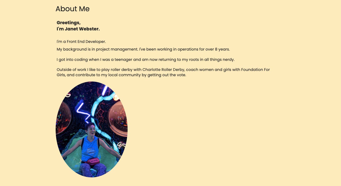
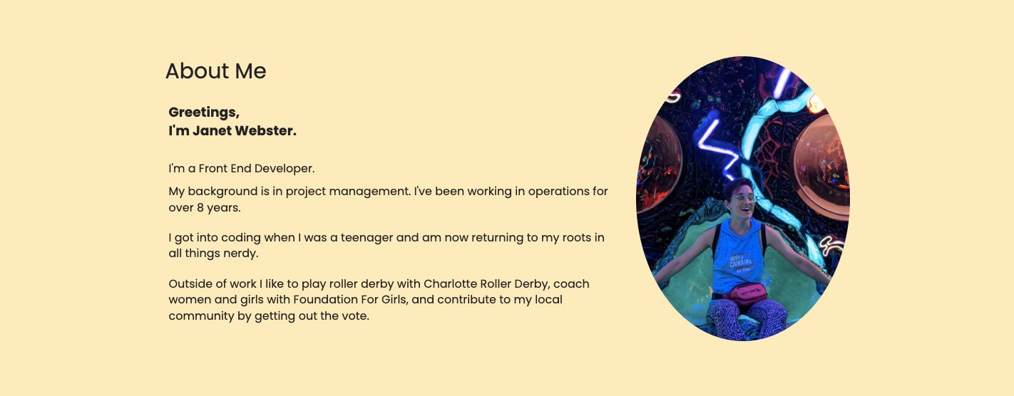
This is the section that isn’t working anymore. The text should be side by side the image from the larger view.
I’m glad to have decided to change up the colors.
I’ll wait for round two of feedback and then hopefully finish it up!
///// ROUND 2
Whew… that was a slog. And I definitely feel like I’ll have at least another round or two after it. Here was the feedback:
Well done subbing in the Sticky Note and Name Tag Generator apps. You've worked hard for these skills and it's time to show them off!
A couple of small changes to make in the Project's section:
The link to the Sticky Notes app goes to the Hotel app and the link to the Name Tag Generator goes to the Recipe Collection project instead.
You could make the logo on the Unplugged project clickable to return to the home page.
I have some suggestions for making this really shine to employers and clients. You've got an awesome portfolio - we just want to make it extra special so employers can't help but be excited about hiring you. This can feel like a long list after you've already worked so hard! But they are mostly small changes.
The mobile and tablet versoins have a horizontal scroll.
I would suggest adding a bit more space between the nav items in the responsive nav so they're easier to click on.
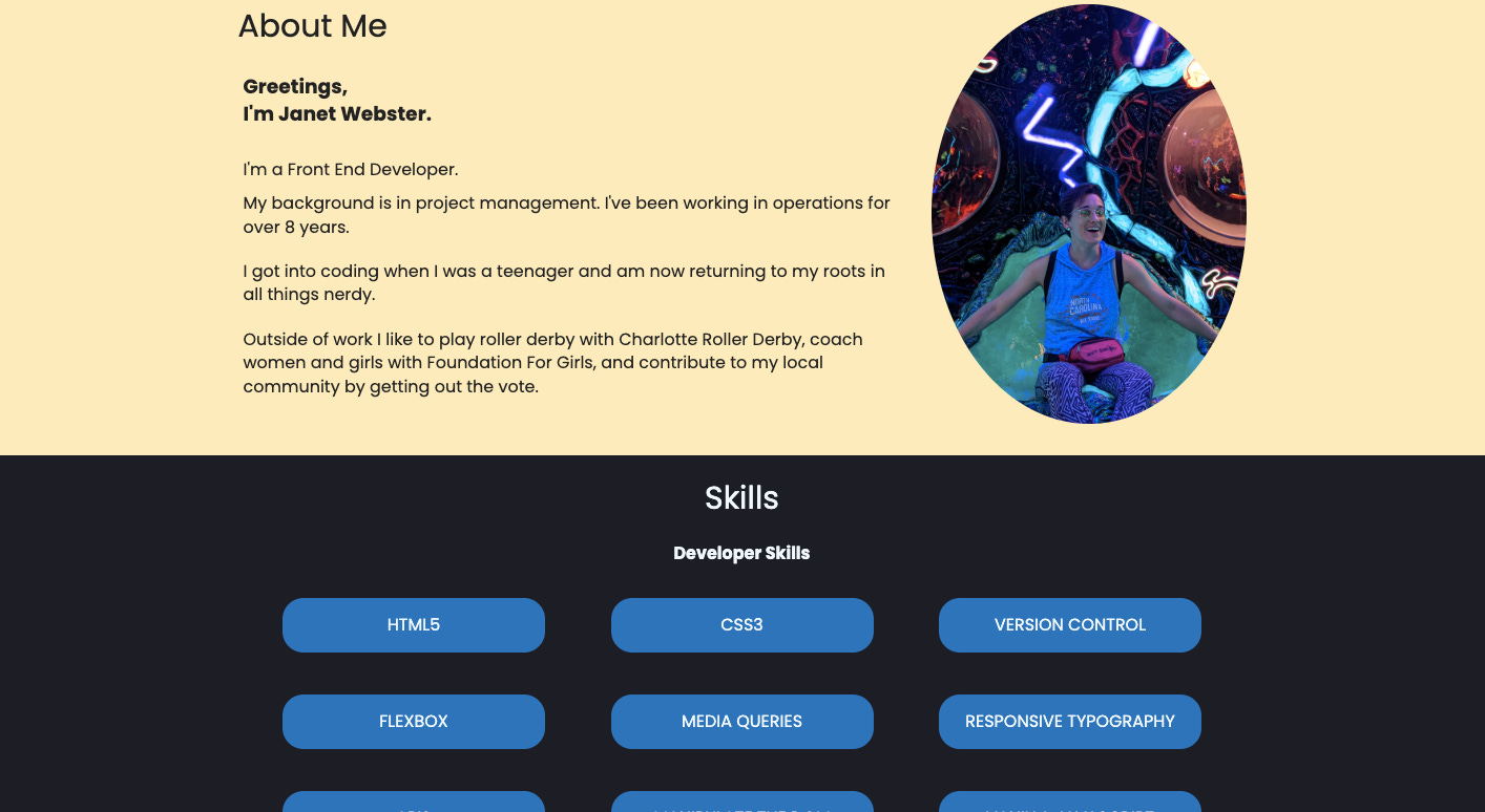
Great job adding a max-width for your content! Looking at the About section, what do you think of placing the text and image side-by-side? (see attached) Then someone can see you as the read about you?
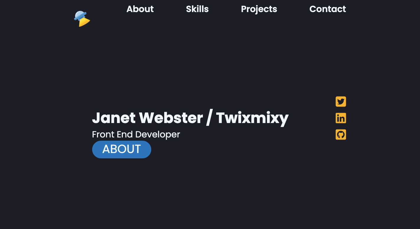
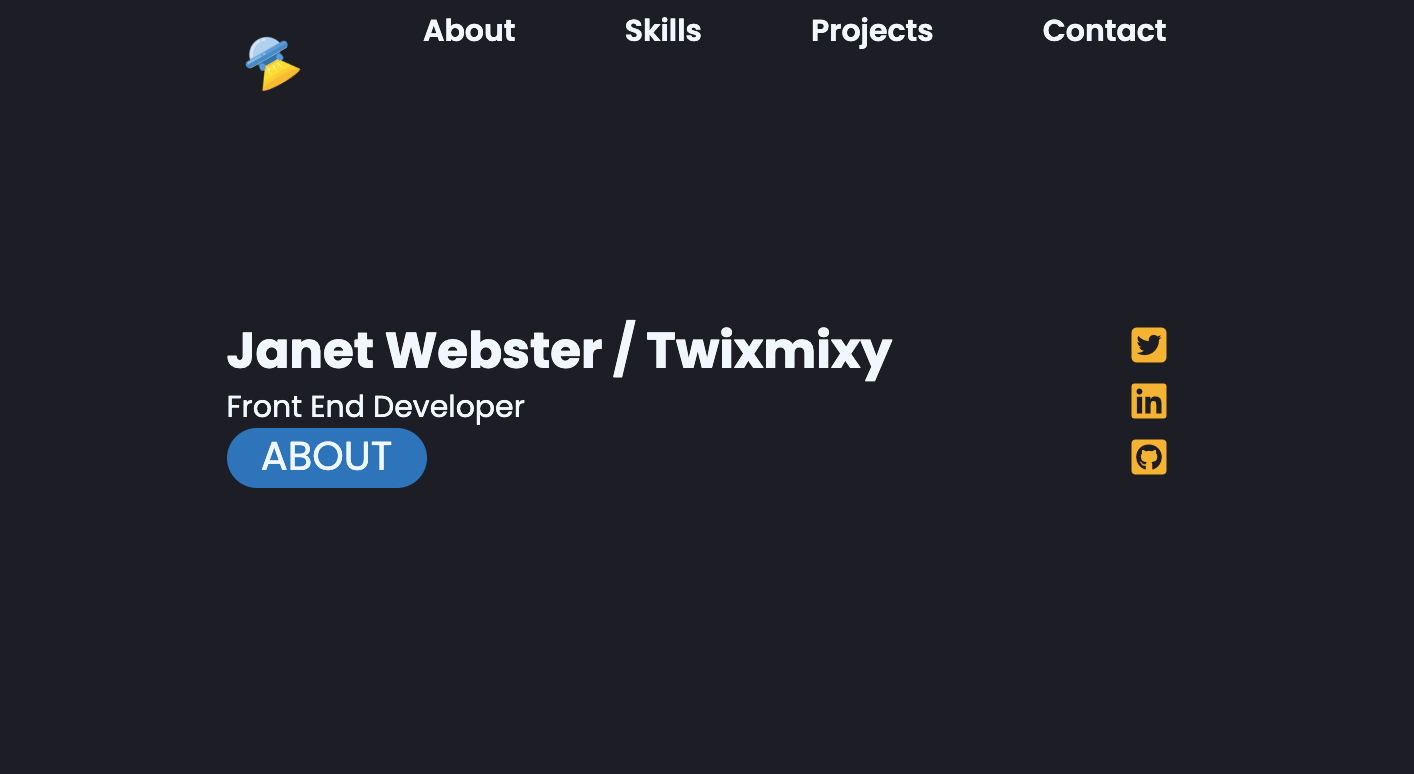
I would suggest adding your full name to the header.
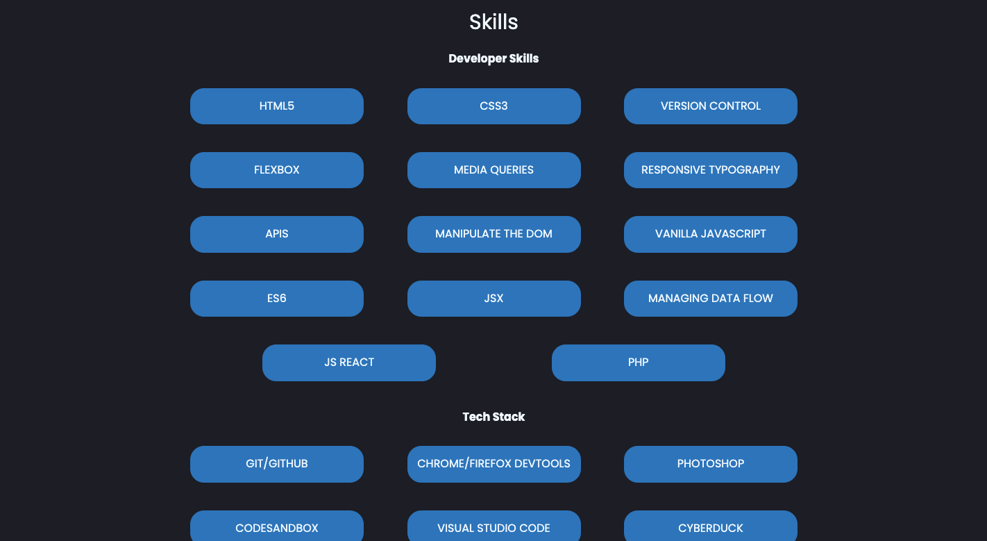
You have several skills you could add to a Skills section. You want to make it easy for an employer to see that you have what it takes to do the job. Check out your progress report in your dashboard's Learn the Skills section for additional options.
After adding a Skills section, you could add a link to it in the nav.
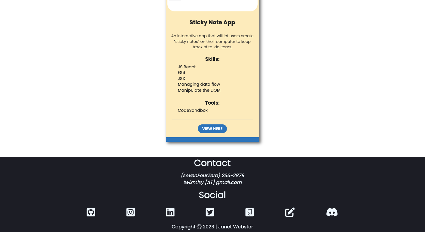
If you made the phone number and email address in the footer clickable, it would be easier for someone to contact you.
On mobile, the social media icons are very close together. It would be difficult for someone to click on the icons with a finger. Maybe you could have them fall into 2 or 3 rows?
You'll want to check to see that the CSS is validated.
You can apply the following to your html block:
html {
scroll-behavior: smooth; }
To smooth the transition to the sections of your site when you click on the navigation items. It isn't a perfect solution because it's not implemented yet in Safari - but for all other browsers it will be much nicer. And for those on Safari, well, they will get the regular jump-link behavior, which is still just fine.
One final thing about your portfolio - you've done a really great job staying active on GitHub. Keep this up and try your best to make regular commits (daily, if at all possible) so you keep that green streak going. Commits don't need to be large, even tiny style changes count. Employers love to see your commitment to working on a project over time.
Let us know when you're ready for us to take another look. Hang in there! Truly the toughest part of building any website is the end. Sooooo many small details to take care of after you've worked so hard. But you are definitely capable of taking care of them! Reach out for help when you aren't sure of what the next step is. We're always happy to help!
Overall these changes were fun to apply, but I was definitely face palming myself for some of them. I’m still struggling for some aspects to look how I’d like them to on mobile. Hopefully the TA can provide me with some insight on that.
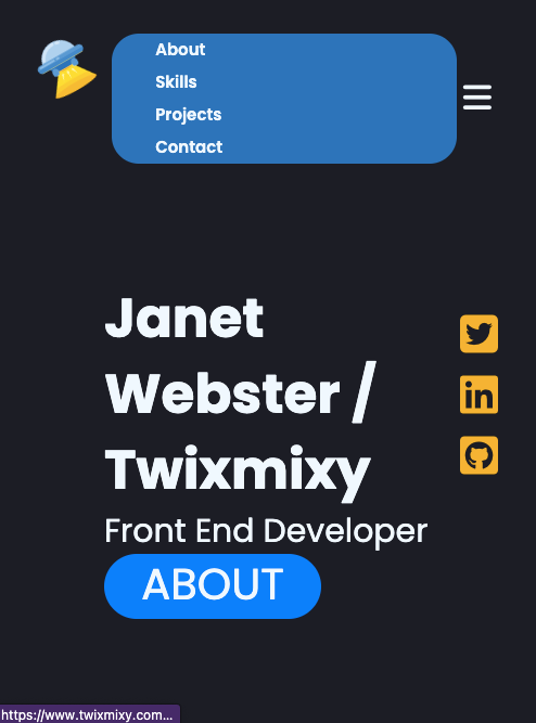
First I want to show you what the mobile nav looks like since you haven’t seen that yet…
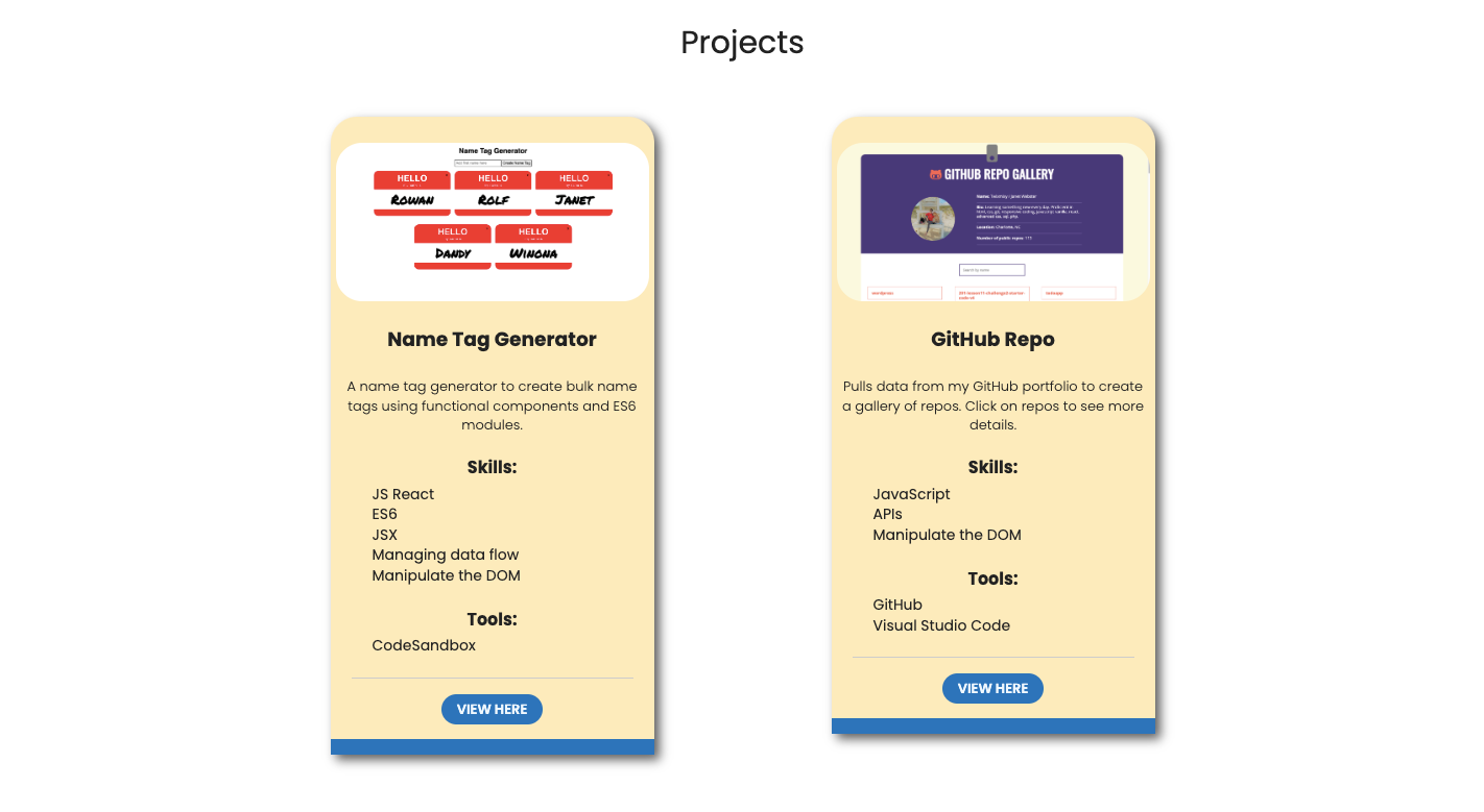
Now on to the rest, including the new Skills section.
Added the new section here to the menu.
Fixed the issue with the image and text being next to each other in the larger screen media breakdown
I was pretty happy with how it turned out. I mimicked a version of this that I saw on the example portfolio and gave it my own twist.
Nothing really different here.
I spaced the social icons a bit different for the mobile version so they won’t be smooshed anymore. The TA recommended making them wrap, but I couldn’t figure it out for whatever reason, so this works…
Now to wait til round 3.
///// ROUND 3
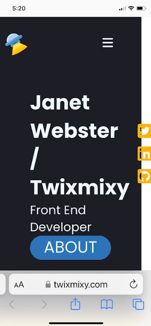
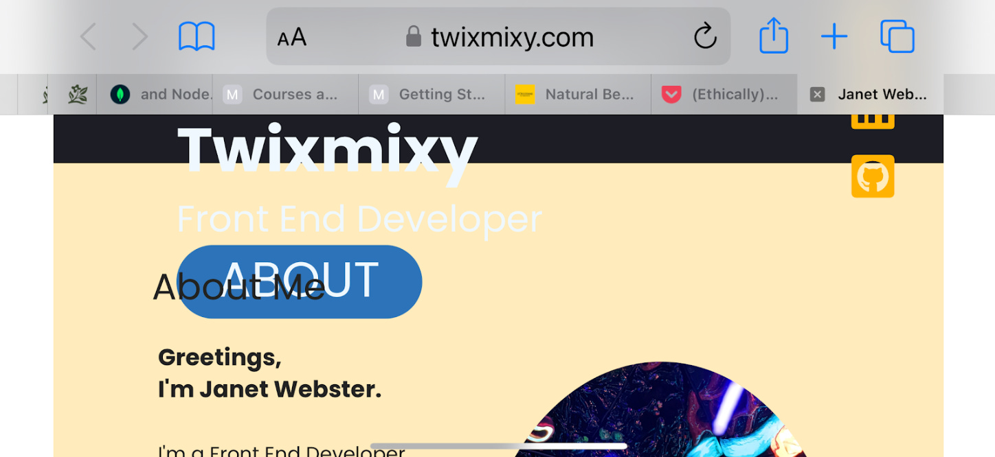
I'm attaching an image of what your site looks like on my phone. There's horizontal scroll in portrait view and overlapping of text in landscape view. That it looks different when you check your phone is a good clue! If you tested the site on you phone, you're likely looking at a cached version. So you might check on changes you made recently.
To start debugging this, look for places that have fixed widths and padding and/or margin. Images can also create horizontal scroll if they aren't contained in a tag like a <figure> tag. For instance, there's 80px of margin on the left of the .hero-text that could be creating some extra width. You might also look at the 80px of padding in the .about-section.
If you're using Flexbox in a row orientation, you usually don't need to add padding or margin to place your content. Much of the layout on the main access can be achieved with different justify-content values.I wonder what it would look like if the nav opened below the logo and hamburger menu. It would give it more space. If you aren't happy with it, you could create a static menu (there's only four items so it can fit well on a mobile site.) Then create a branch of your portfolio to practice the responsive nav until you're happy with it. What do you think?
Well done rearranging the About section! If the total width of the text + image (plus any margin or padding on the sides) is wider than the max-width, it would cause the image to return to the next row.
Great work adding the Skill section! (I'm all about the work!)
It's perfectly fine to implement a contact form later.
Well done spacing out the social media icons! If you added flex-flow: row wrap; to the .social-icons code block, does that layout look more like what you're going for?
Is this the "rotate" you're looking for to pass validation? Instead of min-width: none; have a look at this MDN article to see if you can find a value that will work for your site.
Here we go!
Images referenced:
Ugh!! It looks so bad.
Whew… thankfully I think I was able to fix everything just by editing the CSS.
///// ROUND 4
You're making awesome progress! Your code passes the CSS validator - well done.
Well done taking care of the horizontal scroll! The site looks much better on mobile. In landscape view, the header text is overlapping the About section. Take a look at the height: 100vh; rule. Maybe a bit of padding would work here instead?
If you wanted to not use padding on the left and right in the About section, you could change the value of the justify-content property to center. Then set a width to the content-wrapper of 90%. This will center your content without needing to use padding or margin on the right or left. Maybe play with it a bit to find a solution that works for you design.
Hang in there - you're very close to the finish line.
I did end up removing the 100vh after research I found it does not work for responsive websites.
Submitted for hopefully the final review and approval!
///// FINAL REVIEW
It’s approved!!
Now Skillcrush will also work with me to find a job. It’ll be a big tricky with the bootcamp I’m starting in a month, but all the way around I’m excited!
Thanks for following my journey. Let me know what you think of my portfolio!
As I mentioned at the beginning of this post, was accepted into UC Berkeley! I will be taking their Full Stack MERN Coding Bootcamp. This will begin in September. So now I’ve wrapped my Front End Developer certification, I will begin my UCB pre-work!
I’m not sure what my time for writing will look like during this since it’s an intensive immersive 12 week bootcamp, but I will try to keep you all posted on socials.
No matter what, I’m going to be on LinkedIn and Twitter every day sharing about my coding journey. Thanks for reading!
What did you think? Leave me a comment and share!


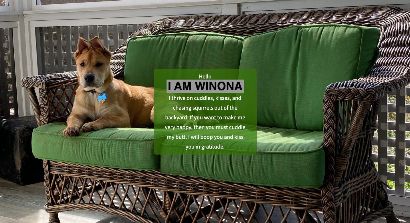
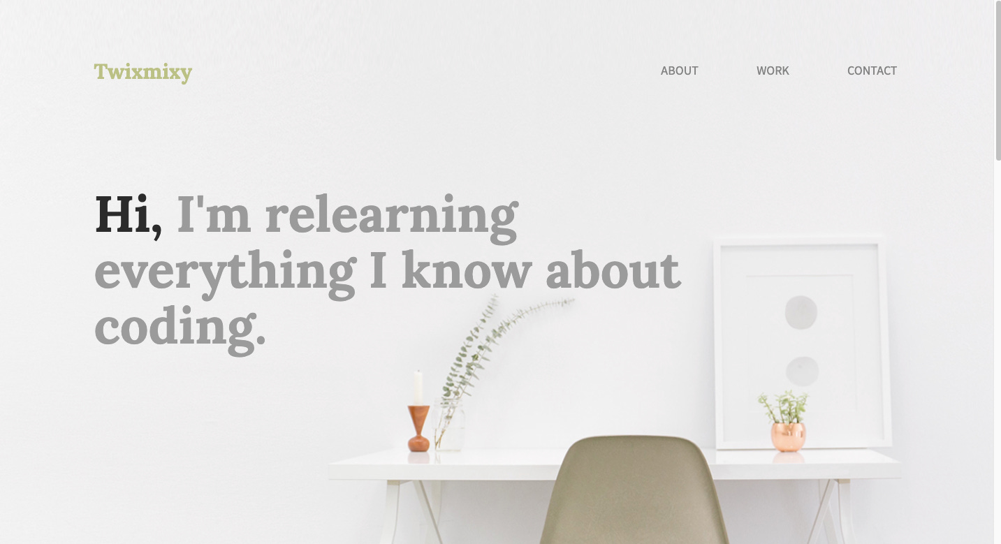
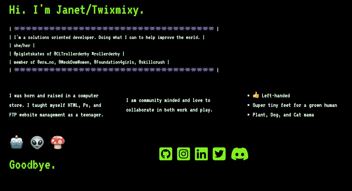



I am so happy you went out of your way to create this post. I to have been on my SkillCrush journey (currently starting JavaScript) and this was just the post I needed to read. Again thanks you for a very inspiring post about your journey.
Your inspired reader, Thomas